3. What’s happening now…
I need to start by explaining a few things I left out of the two previous blogs. I wanted to explain why I haven’t released the entire image and what direction I am taking it right now. A couple of days ago, I was able to meet with Richard E. Turley, who is the LDS Assistant Church Historian and Recorder and is Managing Director of the Family and Church History Department. I showed him my photo of Joseph, and we discussed various theories of how it and other images could have come into play. While I cannot speak for the LDS Church or their representative, I can say that at the time he could not disprove my theories or the photo. I enjoyed talking with him and being able to show him what work I have done as of yet and getting his feedback. With his invitation, our next step is to take it to Salt Lake and allow the Church History Department to examine it further. So for the time being, my plan is to not release a full digital image of my photo.
I also wanted to share a few more things I noticed with the Death Mask Comparison. I had a few questions as to why I didn’t take the mask to the bottom of his face in the picture. I also had a realization as to why many others could not get the death mask to fit the image from the Library of Congress photo. Unfortunately, when I was visiting Gracia Jones, I only had my cell phone camera with me. I knew that when I photographed images at close range, it always gave them a barrel distortion. Luckily, Photoshop has a lens correction applet, and I used it to correct the death mask photo I had taken. I noticed that any kind of distortion could offset the features and how easily the mask and photo would not match. Another thing that I noticed was that in my image there was a distinctive chin line that appeared to be shadowed.
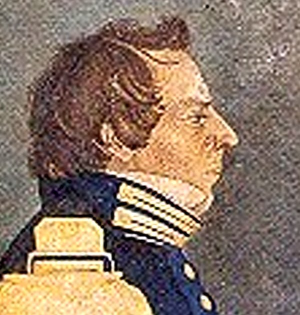
I read accounts of Joseph Smith Jr. gaining weight in his face and body, and I also read about various profile paintings of him, including one by the artist Sutcliffe Maudsley. This artist would shine a light in front of his subject and trace an outline, thus creating a true-to-life profile. I noted that Maudsley’s work showed Joseph with a rather full chin; it looks as though it was almost at a forty-five-degree angle. In my photograph, Joseph’s high white collar almost hides the full spectrum of his chin and jawbone. (I wish these collars were in style now; I sure could use one.) The shadow in my photo is almost a perfect and identical shape of the death mask. Anyone who has played with a camera and taken pictures of themselves lying down knows that it is almost like an instant facelift because of gravity.
My conclusion: previous attempts of death mask comparisons were off because of photo distortion and an over enlarged photo to fit his full chin/neck.
Please feel free to leave comments on the comment link below.
Next clue4. Exciting News UpdateKeep going →